Design systems are one of the most complex undertakings in design. Commonly seen within mobile and web apps, a design system is a collection of reusable components, guided by clear standards, that can be assembled together to build any number of applications. The best way to think of how a design system is built is through this idea of Atomic Design. This is where you have atoms (building blocks, such as inputs or buttons), molecules (collections of atoms that become components, like a search bar with a button), organisms (groups of molecules that make up bigger components, like a header to a site), templates (displaying the relationship of organisms stitched together) and finally pages (placeholder content would be used at this stage).
 At this point, it’s fairly obvious how much work goes into building a design system. There are endless hours poured into UI and UX research and A/B Testing on what may seem like the smallest component but wind up making the biggest impact. Even after a design system is completed, there are times when it is continually improved upon.
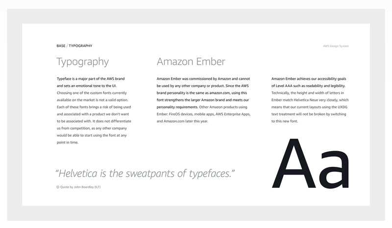
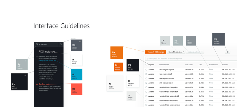
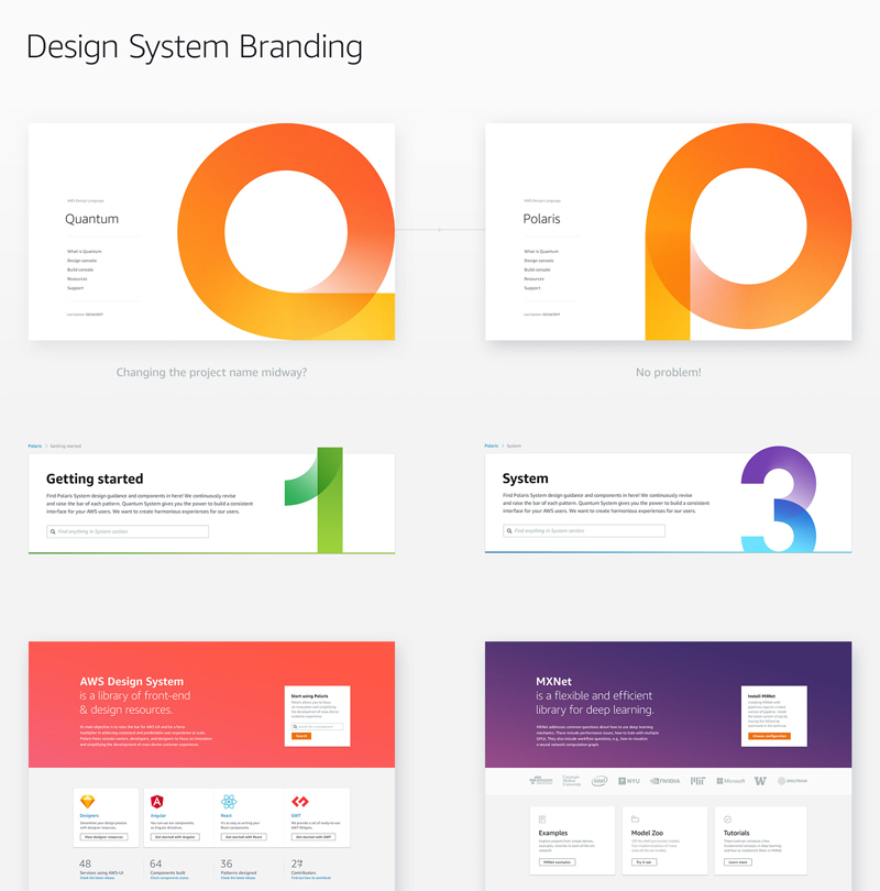
That brings us to Amazon’s Design System for their Web Services, which was recently completed. With a custom typeface and thoughtful interface guidelines created, the design system is robust to the point where even color accessibility is taken into account.


 You can read more about Atomic Design on Brad Frost’s website.
More of the design system can be viewed on Michal Simkovic’s Behance page. Michael is one of the designers who worked on Amazon’s team.