Chiclets, Never Gets Old! Campaign by Amro Thabit

I remember Chiclets being a staple in my youth. My grandmother always had a pack in her pocket-book. I can still smell and taste the overwhelming flavor of peppermint from taking way more than I was allowed to at the time.

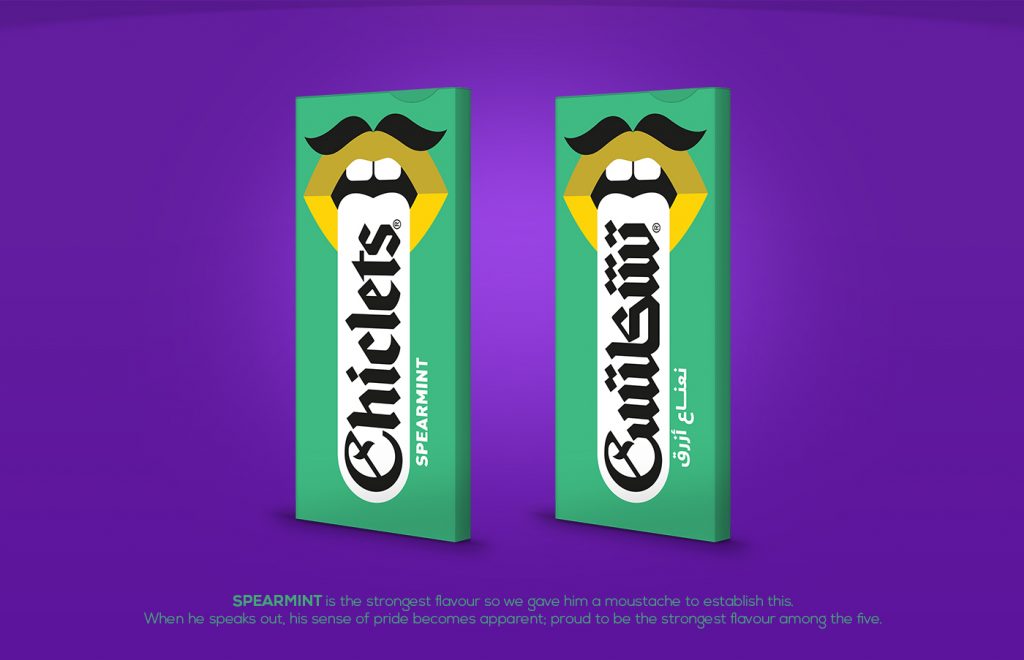
This ad campaign, completed by Amro Thabit, creatively finds new ways to package its five flavors. It embraces a younger generation, while still holding onto its old soul. The existing shape has been transformed into a mouth. To push this further, each flavor has been given a personality by using different colors and elements such as a mustache, braces and many more. While they are unique, they all share a common theme which is a sense of humor.

new york branding sports graphic design studio
Since peppermint is the staple flavor, red lipstick with a simple beauty mark was applied to convey a sense of elegancy.
new york branding sports graphic design studio
Spearmint is heralded as one of the stronger flavors. A mustache was applied to convey this.
new york branding sports graphic design studio
Deemed as the “cutie pie” of the flavors, the pink color with the confetti lips helps to reinforce that idea.
new york branding sports graphic design studio
Mastic is described as having an unusual taste. The stripes with the piercing display the rebellious nature, which is representative of a flavor that is out of the norm.
new york branding sports graphic design studio
The colors are a perfect representation of the classic flavor.

Feeling nostalgic yet? Which one is your favorite?

Check out this post on Alfalfa Studio’s Blog!