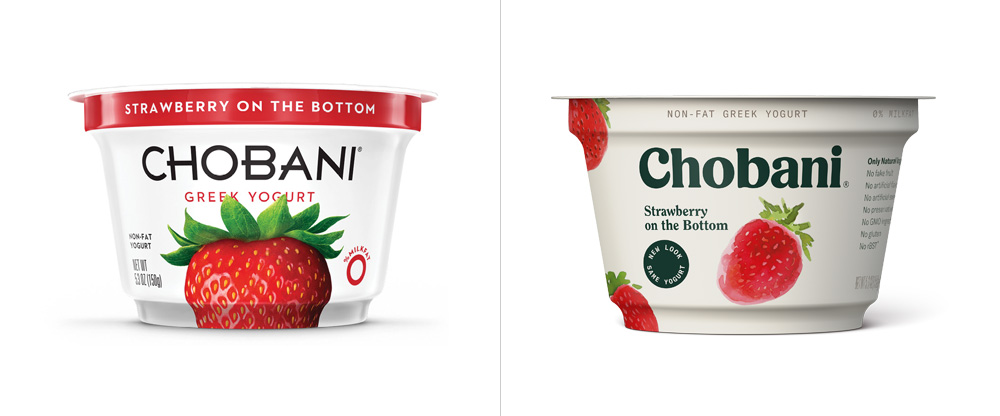
Chobani, the brand of Green Yogurt that has been around since 2007, has become recognizable as one of the best selling brands of yogurt in the U.S.. Fast-forward to now, it is seeing it’s first major brand overhaul, led by Leland Maschmeyer of Collins and I am in love. Not only is it a great execution in design, but it succeeds in an excellent representation of the product.
The new logo-mark, with echoes of the 1960s/70s-eqsue Windsor, is a wonderful example of the slowly rising trend of serif typography. This custom serif typeface helps to capture the rich, smooth, creamy texture of the yogurt, rather then geometric sans-serif that existed before.

The 1970s inspiration doesn’t stop with the logo. The color palette, choice of imagery, the packaging and even the print collateral all have echoes of a 1970s vibe to them.

One of my favorite aspects of the photography is the Norman Rockwell-meets-Works Progress Administration aesthetic, combined with extra saturation to help keep it contemporary.

I was never a fan of the old logo/packaging. I already have little interest in yogurt as it is. But this new packaging, with the off white background adds an inviting warmth of color that definitely makes me want to take a stab at trying out these flavors. The abstraction of each fruit is just enough to keep it from going too quirky.


I absolutely love this new direction for Chobani. As mentioned, I feel it is extremely successful and best of all, it appears to take design seriously.