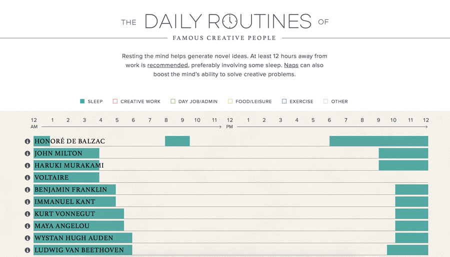
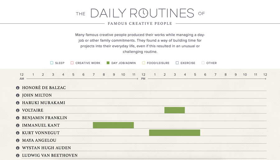
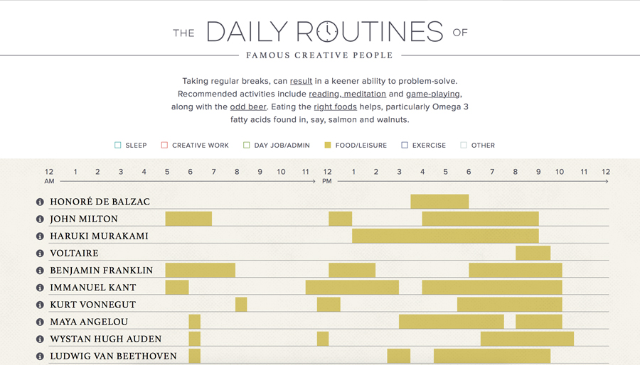
I love seeing what content people use for data visualization. It is even more interesting to see what designers do with that data and how they choose to present it. This is especially true when it comes to interactive data visualization. I recently came across a really cool project that takes Mason Currey’s book Daily Rituals: How Artists Work one step further. It gives the viewer a clear view of how select creative people spent their time. The infograph is pretty straightforward with six filters available to choose from. Below are some screenshots of the infograph.
Ed Gonzalez
Designer | Photographer
Ed Gonzalez
Designer | Photographer


