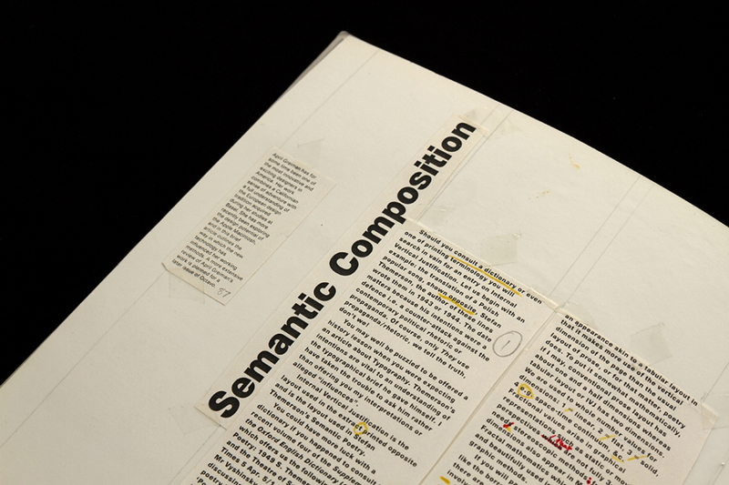
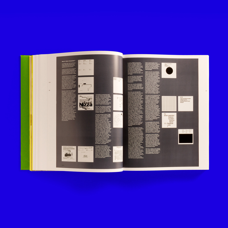
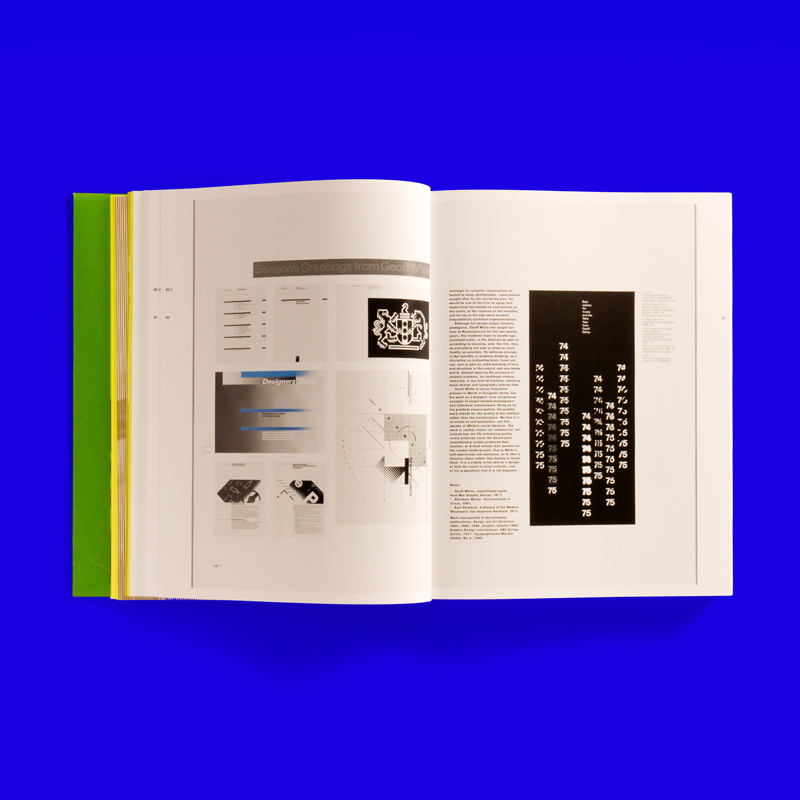
A couple of days ago a coworker of mine brought in a copy of Unit Editions‘ reprint of Octavo magazine. The magazine, which was designed by Hamish Muir and Mark Holt of 8vo, a London-based graphic design firm, was an eight issues series between 1986 and 1992. The first seven were printed in an A4 format while the final was published as an interactive CD-ROM. The magazines are held in high regard because they addressed the history and theory of a new wave of typographic representation and formulation. Because 8vo focused on typographic design as a core component of their work, they felt it was pertinent to showcase the design trends in the UK at the time.
As I was flipping through the reprint, it occurred to me that I simply have not seen typography treated with the precision that it was in these journals. Through these journals, it proved that typography can be expressive as image. But the most incredible aspect of these magazines is that the first couple issues were produced before the beginnings of desktop publishing.
I believe it’s beneficial for not only designers today to view the magazine, but artists in general. It really gives a look into how typography, when handled right, can produce incredible results. The Unit Editions of the reprint also includes reproductions of the handmade mechanicals and proofs, showcasing the amount of precision that went into these magazines. Here are a couple of select spreads:


